FILIA Apartments

FILIA Apartments
Branding for Unforgettable Greek Seaside Experiences

Goal: FILIA Apartments sought a compelling brand identity. They also needed a distinctive visual presence. This was for their Halkidiki, Greece accommodations. The property is located by tranquil Sahara beach. The goal was to communicate comfort and relaxation. Authentic Greek hospitality was also key to inviting guests to an unforgettable escape.

The Challenge

  • Design a compelling brand identity and logo.
  • Embody a serene, home-away-from-home experience.
  • Appeal to a diverse target audience (families, friends, individuals) seeking peaceful holidays.
  • Stand out distinctly from local competitors.
  • Differentiate from generic online booking platforms.
  • Clearly reflect FILIA’s unique market positioning.
Visual Identity & Logo Design

Based on the strategic foundation, a visual identity system was developed to convey the brand’s unique promise.

FILIA Apartments logo
Logo Concept & Inspiration

The FILIA Apartments logo is designed to be both modern and evocative of its natural, welcoming environment.

  • The “FILIA” wordmark uses a clean, contemporary sans-serif typeface, ensuring readability and a fresh aesthetic.
  • Above the wordmark, a simple, iconic sun graphic signifies warmth, light, and the bright, rejuvenating Greek holiday experience. The combination of these elements creates a memorable mark that is both welcoming and sophisticated.

A key element is the stylized inverted ‘A’ in “FILIA.” This unique letterform is subtly crafted to evoke:

  • A gentle wave, symbolizing the nearby sea and relaxation.
  • A nest, representing comfort, shelter, and feeling at home.
  • A branch, hinting at the natural garden elements and organic authenticity.
FILIA Apartments Logo story
Color Palette

Primary Color: Blue

  • Hex Code: #2e3192

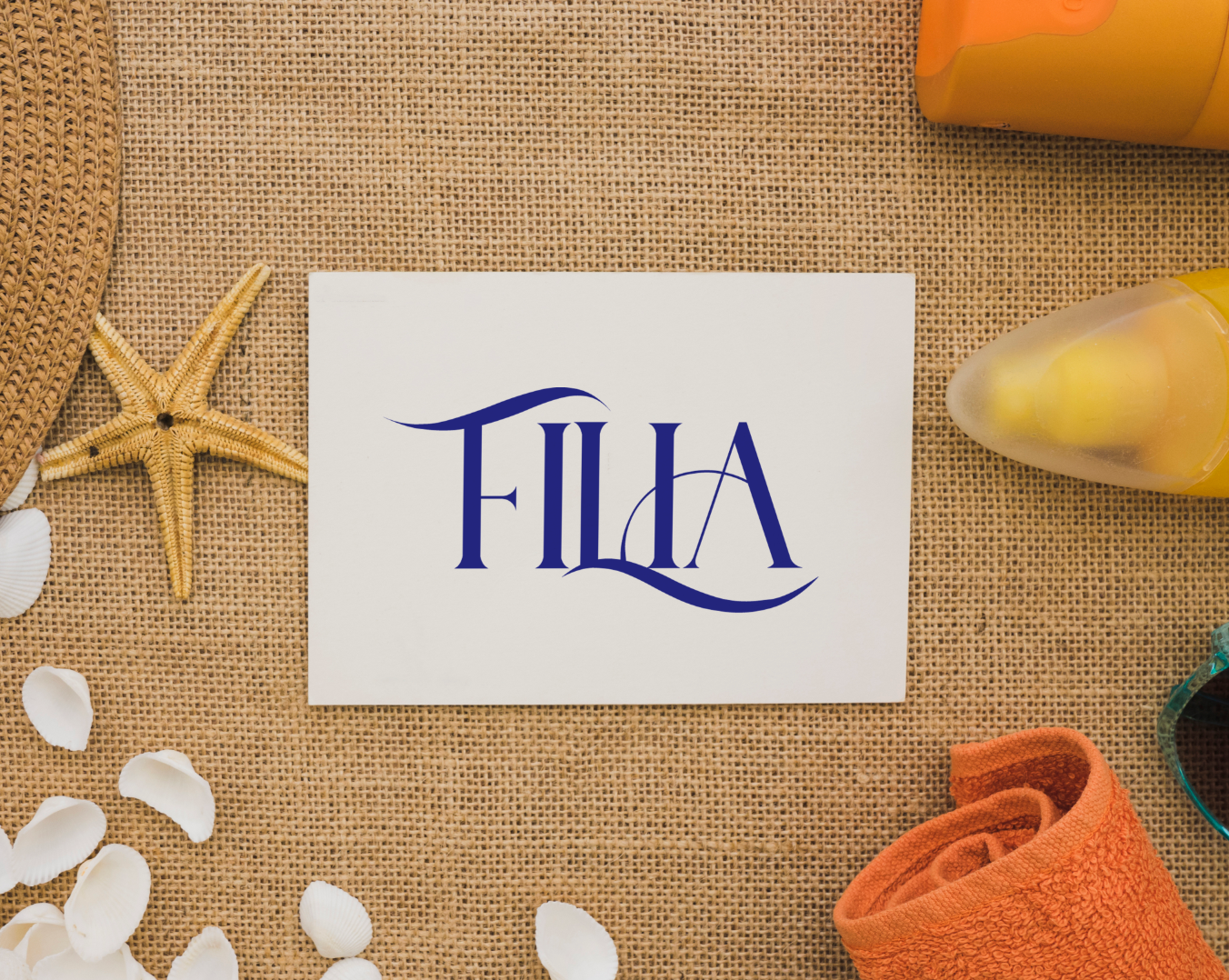
The selection of this specific shade of deep blue is deliberate. It represents the tranquility of the Mediterranean sea and sky, fostering feelings of relaxation, trust, security, and high quality – all central to the FILIA Apartments brand promise.

LEARNINGS

The FILIA Apartments brand identity and logo highlight that a strong strategic foundation, built on clear vision and values, is crucial for effective branding. A distinctive visual identity, encompassing logo and color, is vital for differentiation and creating an emotional connection with the target audience. Ultimately, clear positioning and authenticity ensure the brand resonates deeply, delivering on its promise of an unforgettable, comfortable experience.

Interested in creating a compelling digital experience? Contact me or explore more of my projects below!