NEXT PROPERTY

NEXT PROPERTY
Designing The Future Of Property Management

Goal: 

NEXT PROPERTY is a new real estate agency entering Skopje’s competitive rental and sales market.

To challenge long-established local firms, the brand needed a definitive promise: direct, personal management of every property. From the initial listing photo to the final signature, the agency offers a turnkey solution built on speed and transparency.

The Challenge

  • Build trust from scratch against deeply entrenched local competitors.
  • Engage diverse audiences – from students to investors -without diluting the brand message.
  • Convey speed and progress while maintaining a personal, non-transactional touch.
  • Maintain a premium position against indirect competition from investment and lifestyle brands.
  • Unify full-service offerings – legal, valuation, and management – under one coherent brand identity.
BRAND VALUES​
  • Communicative
  • Positive
  • Professional
  • Fast
  • Reliable
  • Dedicated
BUILT FOR SIX AUDIENCES​
  • Owners
  • Renters
  • Students
  • Foreign residents
  • Investors
  • First-time buyers
VISUAL IDENTITY & LOGO DESIGN

One mark, built to carry the whole promise

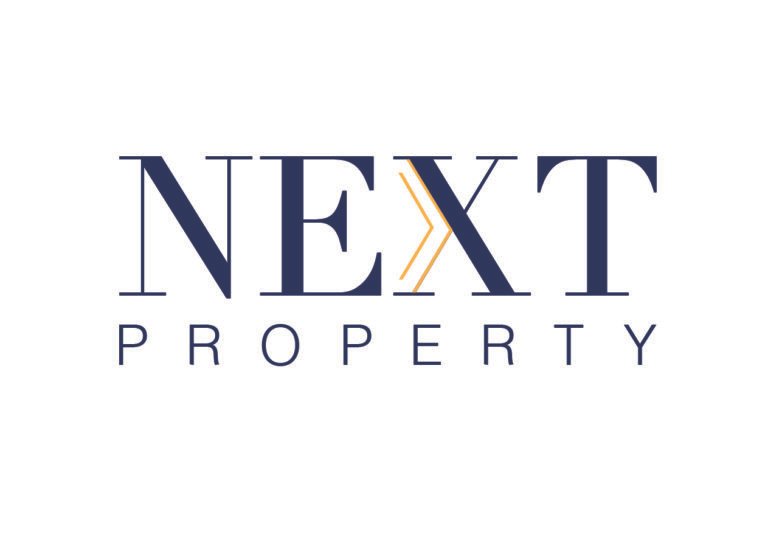
The wordmark features NEXT in bold, structural uppercase. This projects confidence in major financial decisions. PROPERTY is wide-tracked below for clear hierarchy. One deliberate design choice sits within the X.

NEXT PROPERTY is a new real estate agency
Next, literally

The brand name is now structural. A double-lined gold chevron sits inside the X. It creates a sense of forward motion. The mark symbolizes the next step and home. It reads instantly as progress toward the next listing.

NEXT PROPERTY is a new real estate agency entering Skopje's rental and sales market
COLOR PALETTE​

Calm authority with one warm signal

  • DEEP NAVY – TRUST & STABILITY

This color is used sparingly for key elements. It highlights the chevron, calls-to-action, and listings. It provides energy against the calm navy background.

  • SIGNAL GOLD – QUALITY & MOMENTUM

Supporting neutrals use a warm sand tone. These shades reflect home, warmth, and security.
Learnings

The symbol is built directly into the name. This single mark anchors every branding asset. It covers social posts, infographics, and PR features. The identity scales across three rollout phases. Every touchpoint carries the same core promise. There is always a clear next step. The brand ensures this step is short.

Interested in creating a compelling digital experience? Contact me or explore more of my projects below!