Boomerang

boomerang brand materials
Brand Identity for an Emotional Intelligence Center

Goal: Develop a brand identity for Boomerang, an educational center for emotional intelligence, that reflects its core values and target audience.

The Challenge

  • Communicated its core values – Empathetic, Powerful, Caring, Sociable, Credible
  • Appealed to both children and parents
The Solution

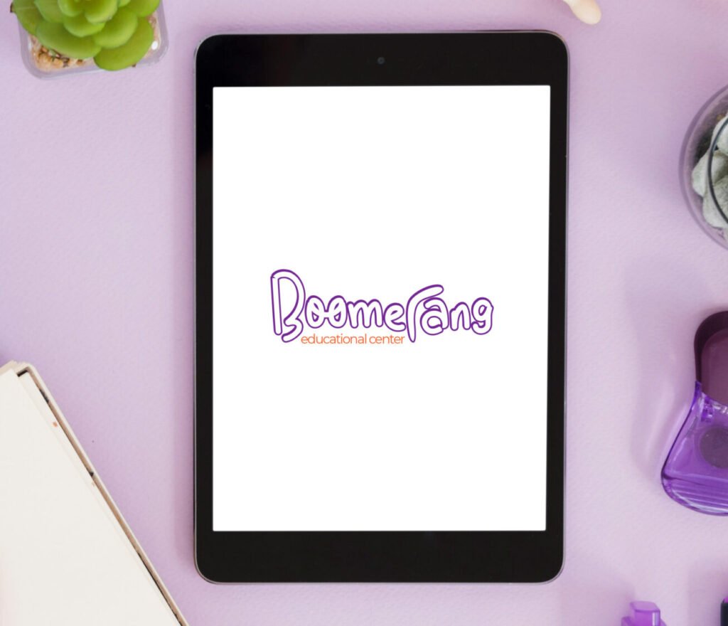
Logo Design – A playful yet professional logo incorporating a boomerang motif.
Color Palette – Violet (symbolizing wisdom and independence) and Orange (representing enthusiasm and creativity).
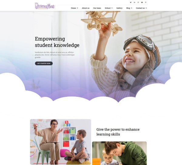
Visual Elements – Imagery that evokes connection, emotional intelligence, and learning.

Boomerang logo design
Design Highlights
  • A logo design that is memorable and versatile.
  • Color palette that evokes trust, warmth, and intelligence.
  • Imagery that represents connection, growth, and learning.
boomerang brand materials
Impact
  • A strong, cohesive brand identity that accurately represents Boomerang.
  • A design that appeals to the target audience (children and parents).
  • Versatile brand assets that can be used across various platforms and applications.
Boomerang web site
Learnings

Balancing playfulness with professionalism is key for education brands. Color choices powerfully convey brand values and emotions. Versatility ensures the brand works across all platforms. Deeply understanding the audience makes visual storytelling effective.

Interested in creating a compelling digital experience? Contact me or explore more of my projects below!